Thursday, August 12, 2010
Tuesday, August 10, 2010
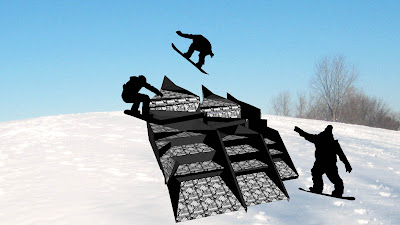
3D Concepts with repeatable pattern
Thursday, August 5, 2010
Re-drawing into Sketch-up designs
Contrast: I am really pleased with the out come of this image because I think that through the process of re-drawing into the image it has become more dynamic.
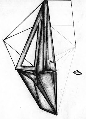
Datum: I am pleased with the out come of this image as I think that through the process of re-drawing into the image it has evolved.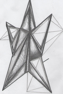
Symmetry: I think this image needs to be repeated in oder to make it a bit more interesting.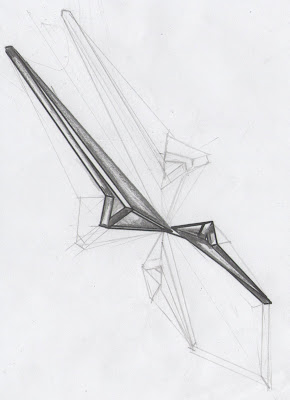
Rhythm: I am also pleased with the out come of this image because as I have repeated it, it has become more three dimensional.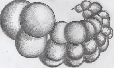
Proportion/Composition: I think this drawing still needs some work as it is still pretty simplistic.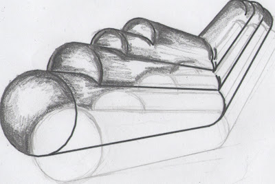
Hierarchy: I found it very difficult to re-draw into this image and to be able to create the effect I wanted. Unfortunately I did not capture the look I was going for but I think it will be easier to do so in sketch.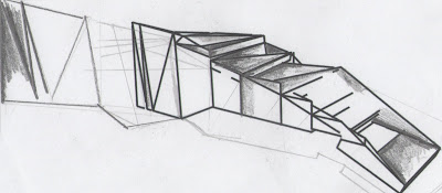
Figure ground: I am happy with the outcome of this image as I think that through the process of re-drawing into the image it has become more interesting.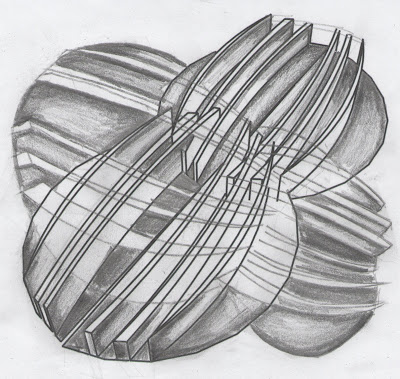

Datum: I am pleased with the out come of this image as I think that through the process of re-drawing into the image it has evolved.

Symmetry: I think this image needs to be repeated in oder to make it a bit more interesting.

Rhythm: I am also pleased with the out come of this image because as I have repeated it, it has become more three dimensional.

Proportion/Composition: I think this drawing still needs some work as it is still pretty simplistic.

Hierarchy: I found it very difficult to re-draw into this image and to be able to create the effect I wanted. Unfortunately I did not capture the look I was going for but I think it will be easier to do so in sketch.

Figure ground: I am happy with the outcome of this image as I think that through the process of re-drawing into the image it has become more interesting.

Wednesday, August 4, 2010
Design principles-3d sketches
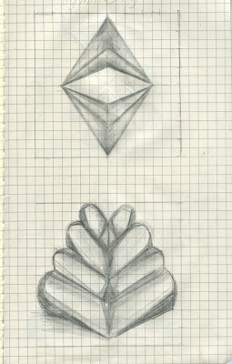
These are my hand drawn 3D sketches for the chosen design principals. I chose to develop aspects of the chosen 7 designs as I wanted them to be less complex and more elegant. It will be interesting to see how I can develop them in Sketchup. (Designs in order are.. Symmetry, proportion/composition, Rhythm,Hierarchy, Figure ground, Datum and Contrast)

Tuesday, August 3, 2010
Subscribe to:
Comments (Atom)


